Photography, painting, drawing and even window-dressing!
Because it tends to flit about and escape quickly, the human eye needs to be led. You have to attract its attention, then guide it, but not too much... Create harmony and balance, but avoid unsurprising symmetries.
Producing images for educational or aesthetic purposes therefore involves composition, organization and the search for harmony between shapes, colors, hues and masses...
Here's a guide to the basics of visual composition.
The fundamentals of good photography....
Numerous websites offer advice on how not to mess up your photos. It's not a question of making beautiful, aesthetic photos, but of avoiding mistakes that betray amateurism.
The rule of thirds consists in dividing the image into three horizontal and three vertical parts. The result is a grid of nine squares, allowing you to determine the areas where the eye will most readily focus. This rule is so popular that a grid is included in the viewfinder of some cameras and many graphics software programs. The online magazine Lense gives us some convincing examples.
The video by the Groupe des photographes tunisiens (Tunisian Photographers' Group) below will also give you some examples.
Websites for photography enthusiasts regularly present the criteria for a well-composed photo. The rule of odd numbers, the frame within the frame, depth of field and "filling" the frame are just a few of the composition and framing tricks you'll find in the resources at the bottom of this article and in the video below.
To take things a step further, D@dou suggests a detour into the world of painting.
Like all rules, those that are sometimes presented as definitive recipes to avoid missing any more shots need to be known... the better to transgress them.
Go deeper
The most useful book for further study of composition is undoubtedly L'art du cadrage et de la composition by Duc, published by Fleurus. The artwebbook blog refers to it extensively.
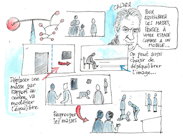
Mass balance
To be sensitive to mass balance, you need to take a step back, away from the details. You can learn to see any image as a painting by Kasimir Malevich, the inventor of Suprematism.
A solid black can only be balanced by a larger solid gray. A red mass must be balanced by a much larger mass...
And as these masses have meaning, their significance contributes to their relative weight. If the character on the back needs to balance the one on the front, he'll have to occupy a larger space...
Opting for imbalance can also add strength to the image. Now that the rule of thirds has become generalized as an academic principle, those who transgress it with talent are more eye-catching.
Hierarchy of elements
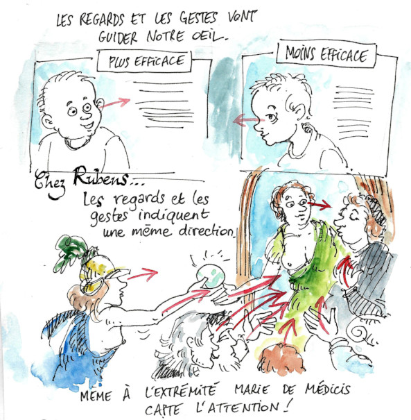
Not all elements attract attention in the same way. Our eyes don't just see masses of color. A face attracts more attention than a rock, even if the rock is much bigger.
In the image below, the numbers show the hierarchy of elements. The human attracts more attention than the dog, which in turn is seen before the car, and so on. So how do you draw attention to the dog? By truncating the human and moving the animal according to the rule of thirds, we place it at the center of attention.
If an image seems empty or unbalanced, and an element needs to be added, the hierarchy of elements will be a great help. In the image below, a bush is placed to balance a tree. If we had placed a character or animal of equivalent volume, the tree would have become invisible!
Lines of force
How do you use arrows to represent the path of the eye on a photo, painting or magazine page? The answer to this question will enable us to draw the lines of force. If they've been thought out beforehand, chances are the image will be more effective. These may be diagonals or simple curves, but they can also be complex, as in Renaissance or Flemish paintings from the 16th century.
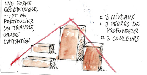
Staging a showcase.
Setting up a showcase means creating a three-dimensional space. While it's important to attract attention, it's also important to maintain it by moving the eye from one item to another. A window display that's too elaborate gives the impression of a low-end store. Very plain, with just one or two items surrounded by plenty of space, it's more likely to evoke luxury.
Apart from these two extremes, window displays follow a series of rules, as xlsoft reminds us in several articles devoted to this technique. Three levels of presentation, three levels of depth, a limited palette of colors... A pyramid presentation ensures harmony between the products presented.
Whether it's a question of photographs, drawings or graphics, or even displays or showcases, the rules are fairly similar: think in terms of mass, color associations and guiding lines, with an emphasis on simple shapes. Of course, it's important to think in terms of volume, but also in terms of empty space and breathing space.
The same advice applies to the design of a page layout, with the added difficulties of overall coherence and the use of grids.
Learning a language is not just about acquiring its grammar. Culture, customs, and linguistic specificities are all indispensable elements to be transmitted to learners to facilitate their integration.
The "purity" of a language will seem an incongruous idea after this exercise. The language will appear all the more alive. A short exercise to be done in groups; lively and fun dicussions to follow.
Today's the day.
I'm being visited by an inspector. Like many colleagues, I wondered what I was going to present to him. Should I rehearse with the students? Should I warn them? Should I show him what a real lesson is like, or give him the spectacle of a model lesson? All these questions are still on my mind, as he's due to arrive any minute.
Because learning theory is important but insufficient to master the operational aspect of a subject, it's possible to take part in a project in the field. So setting up a Junior Enterprise or a Christmas chocolate sales campaign can become an opportunity for real-life experimentation, turning knowledge into know-how.