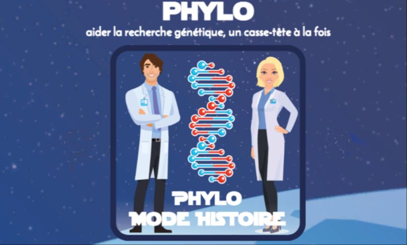
Phylo - Learn how to sequence a genome!
A game to enter the fascinating world of genetics.
Publish at April 14 2009 Updated June 05 2026


Daytum is an Internet service that graphically compiles all the data you entrust to it, day after day, week after week, month after month.
You can also see what other people are compiling, and sometimes there are surprises in store.
Whether it's objective data such as the number of rainy days or birds seen at the window, or more subjective data, Daytum draws portraits....
For what purpose? Its author's!
Compiling data for a school assignment, for personal use or to impress the gallery, nobody minds.
So you can objectively estimate different occurrences, your behavior, keep your resolutions, achieve your goals or simply waste your time.
Too many, too many or too few according to your criteria?
The service is pretty cool and well designed; you can compile up to 6 sets of data for free. It's a good idea to try out the different display types to choose the ones best suited to your data.
Image accuracy varies according to exposure time and the number of categories, sensors, etc.
Learn more about this Technology
You might also like:
Koam, playing with balanced nutrition
A veritable showcase for public health, Koam was developed by Nutrikeo, a consulting firm specializing in nutritional strategies. Supported by BPI France, the Nouvelle Aquitaine region and Europe, Koam is the result of two years' work by a team of leading specialists in nutrition, childhood, pedagogy, sociology, digital and behavioral theory.
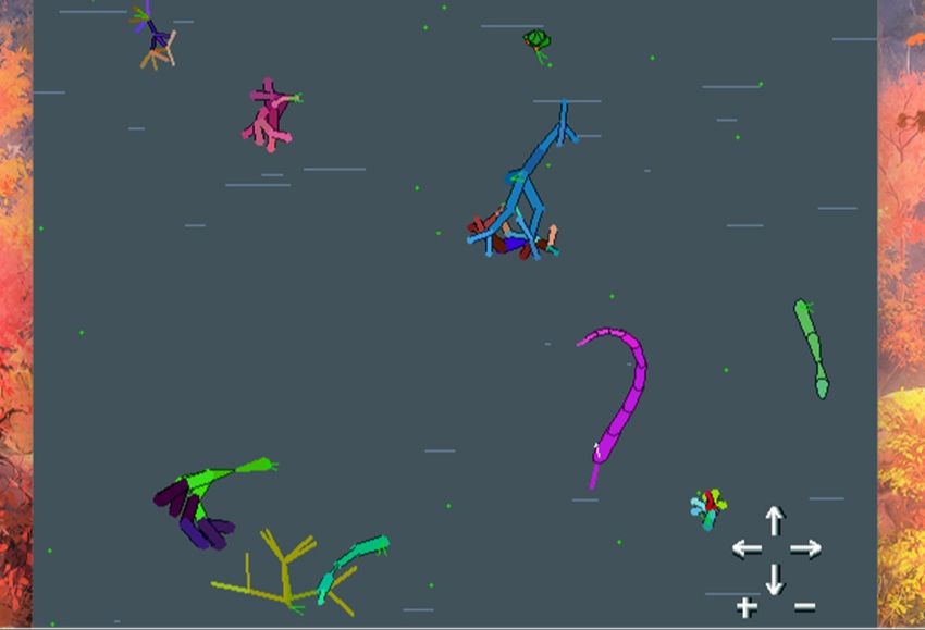
A virtual aquarium to understand Darwinian evolution
Is it possible to understand evolution through simulation? It would seem so. A very interesting resource for high school science classes.
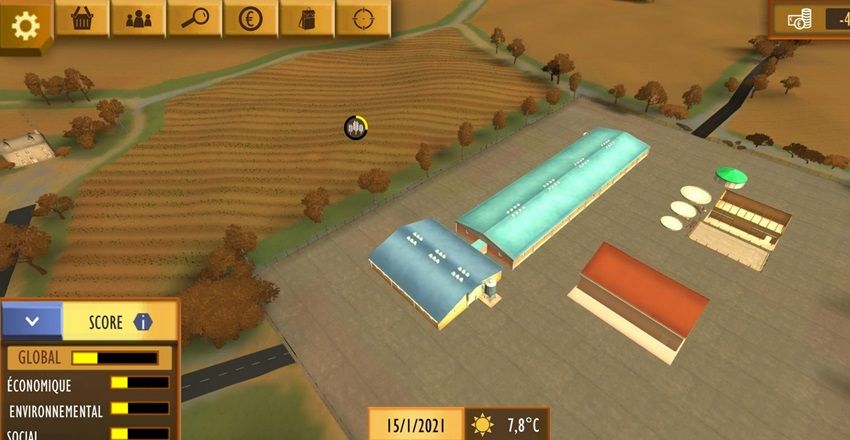
Reflecting on agroecology through play
There's nothing simple about being a farmer. You have to plan your activities throughout the year, make sure you have the right machinery, maintain it and so on. All with a view to ecology. A serious French game seeks to teach agroecology.